Overview
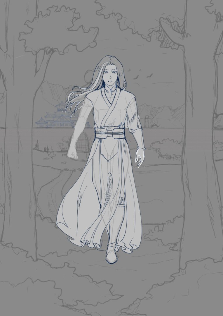
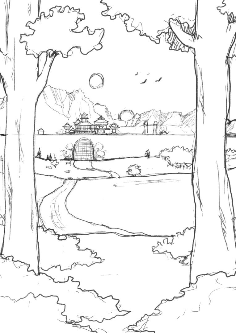
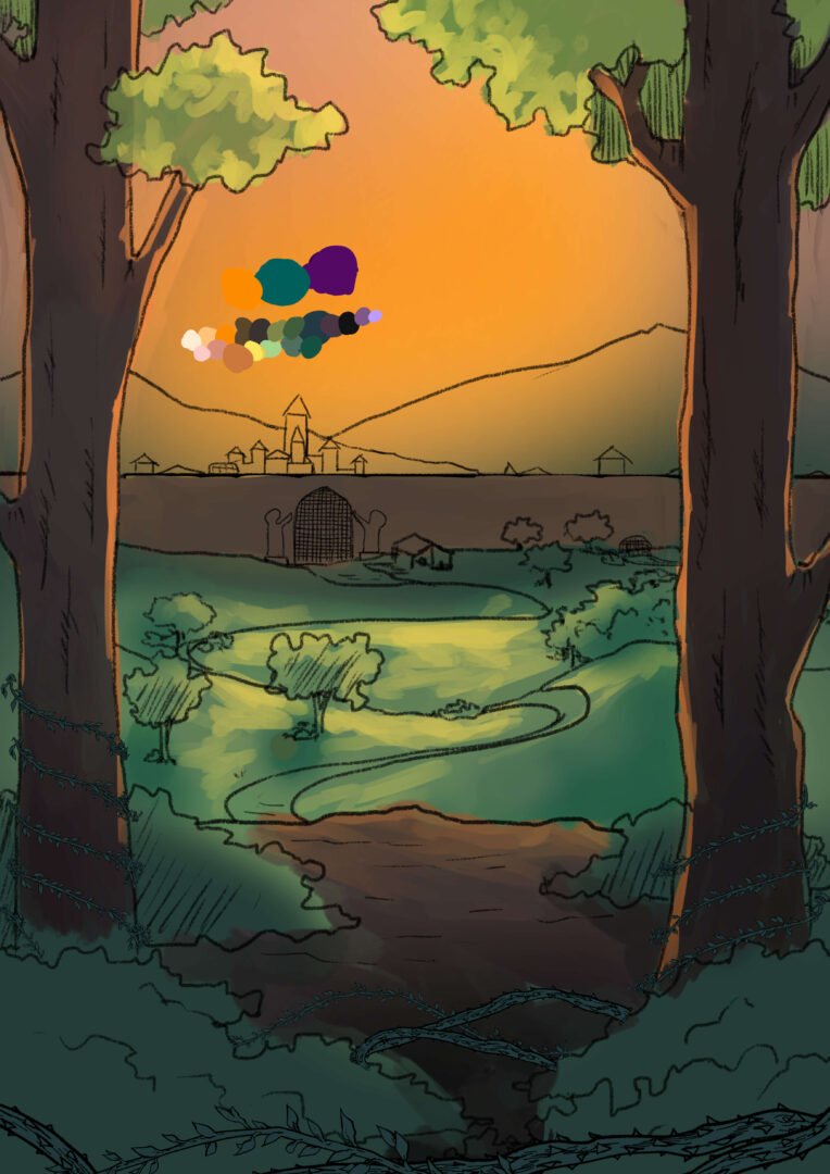
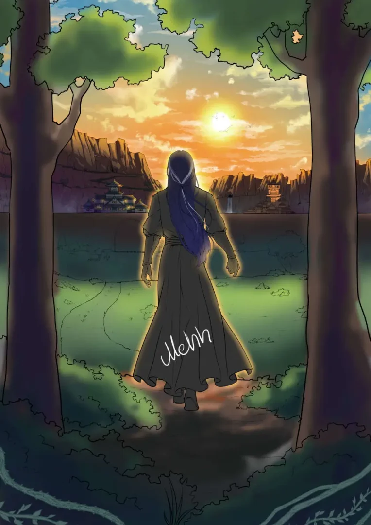
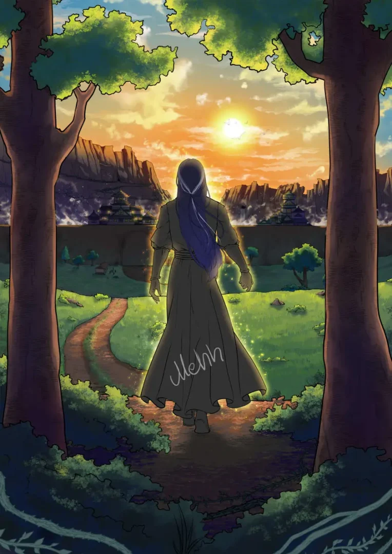
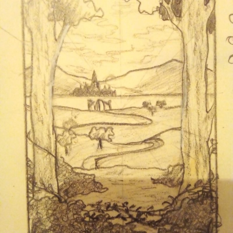
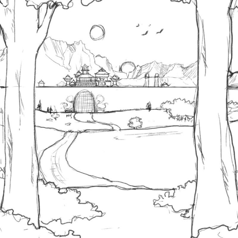
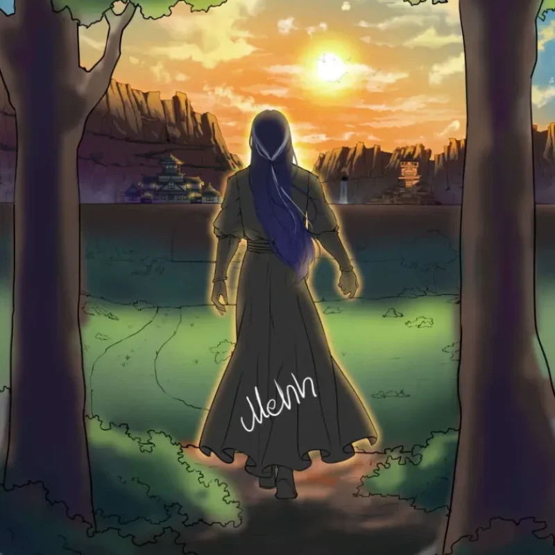
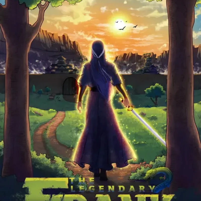
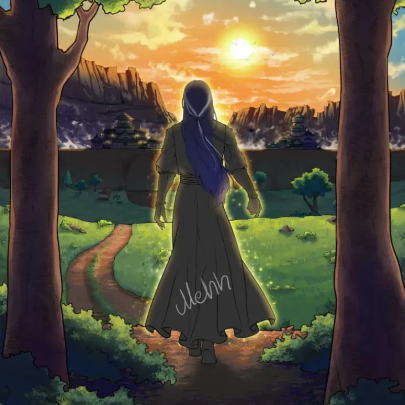
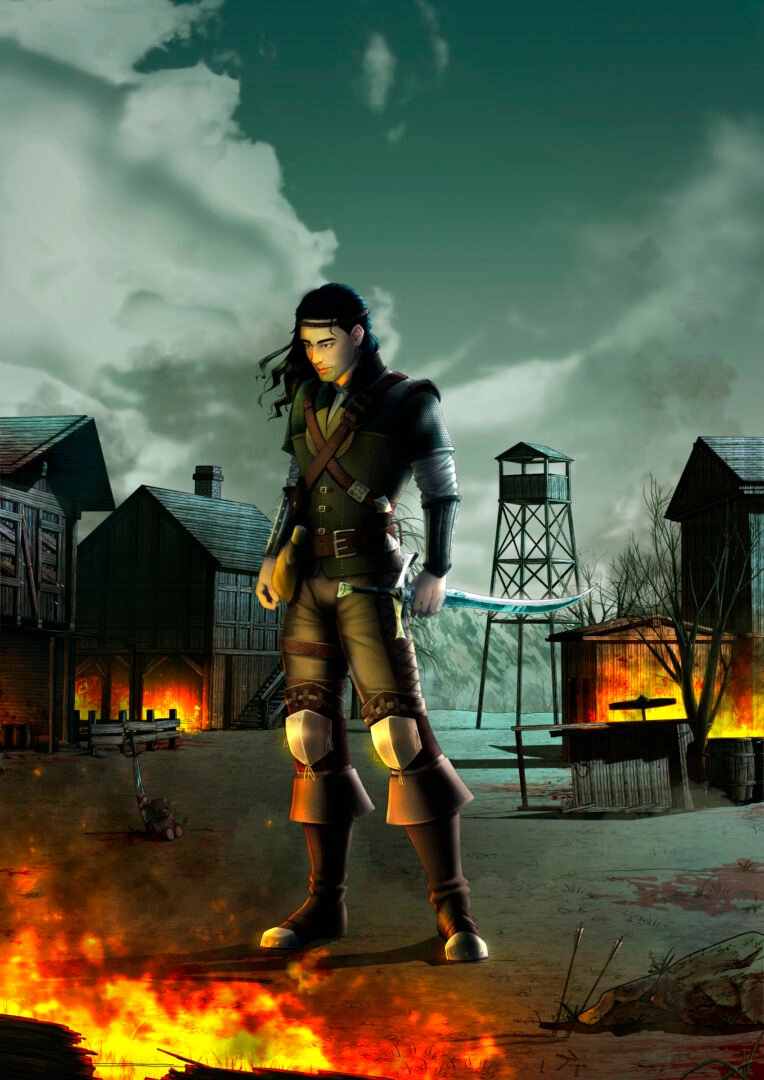
The second in the trilogy—and my personal favorite. I had the most fun sketching and rendering this one, although it also felt like the most effort, particularly with the illustration. The concept was straightforward: the main character walking out of a forest into a new city surrounded by a massive wall.
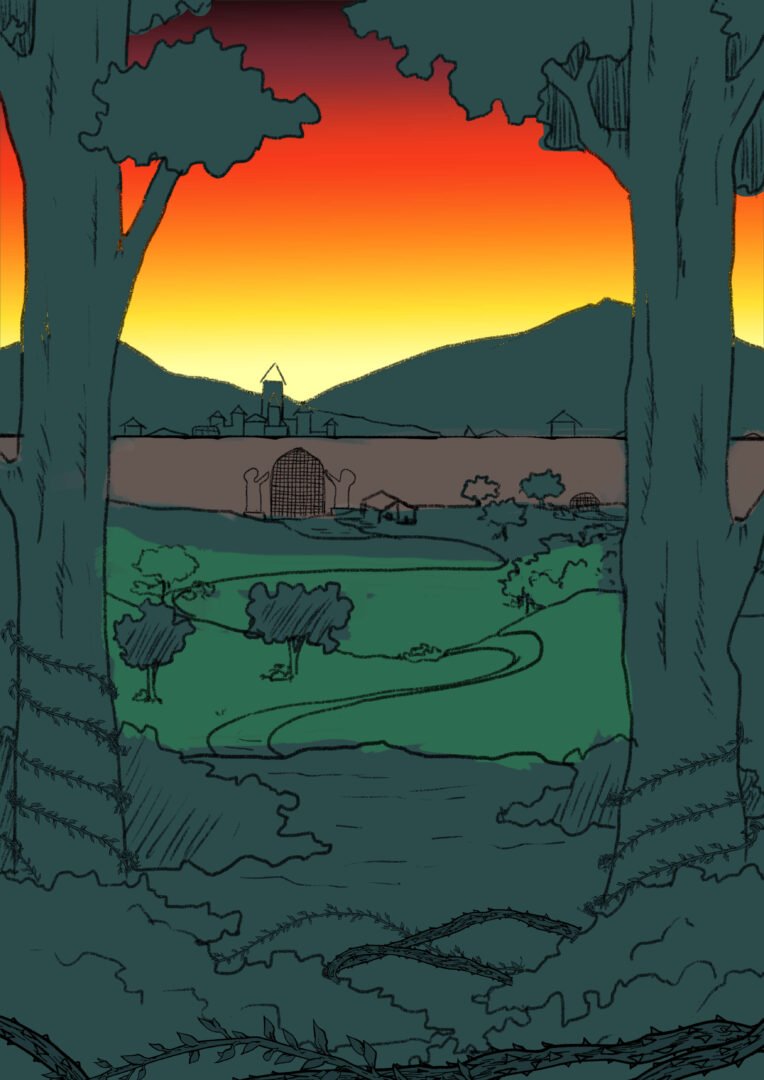
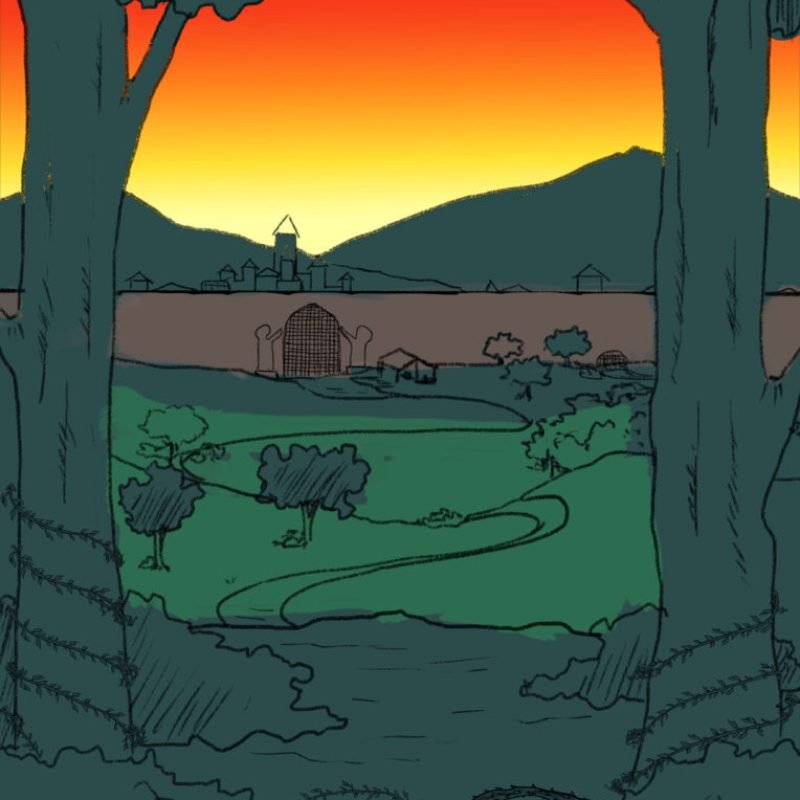
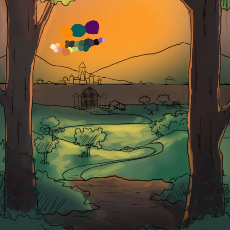
I went through numerous sketches, and most of them followed a similar color scheme. After a few rounds of consultations and critiques, an issue arose—the vibrant sunset in the background was overpowering the rest of the illustration and typography, making it hard to tone down the orange hues effectively.
Involvement
- Illustration
- Design
- Marketing Materials
Approach
While creating this cover, a few questions kept coming to mind:
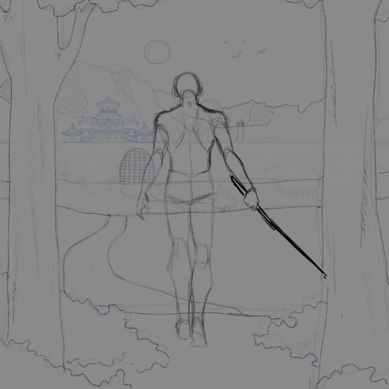
- Composition: How to frame the scene to highlight both the character and the cityscape.
- Color Scheme: Balancing multiple colors for harmony, which was a challenge, given the complexity of the scene.
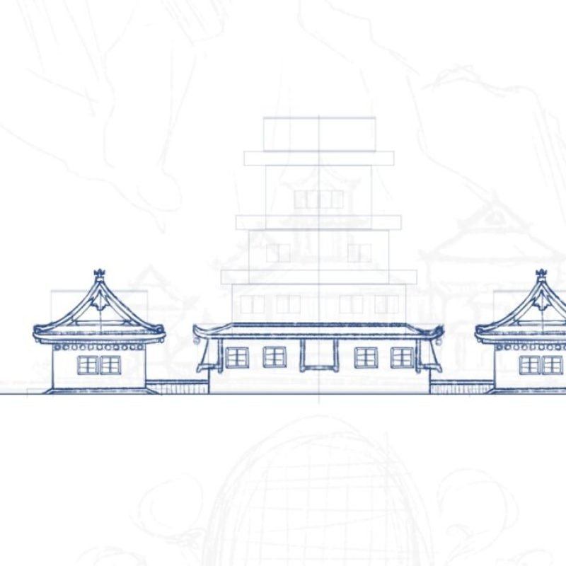
- Architecture and Character Posing: Finding a way to convey the scale and personality of the city, as well as how the main character would interact with it.
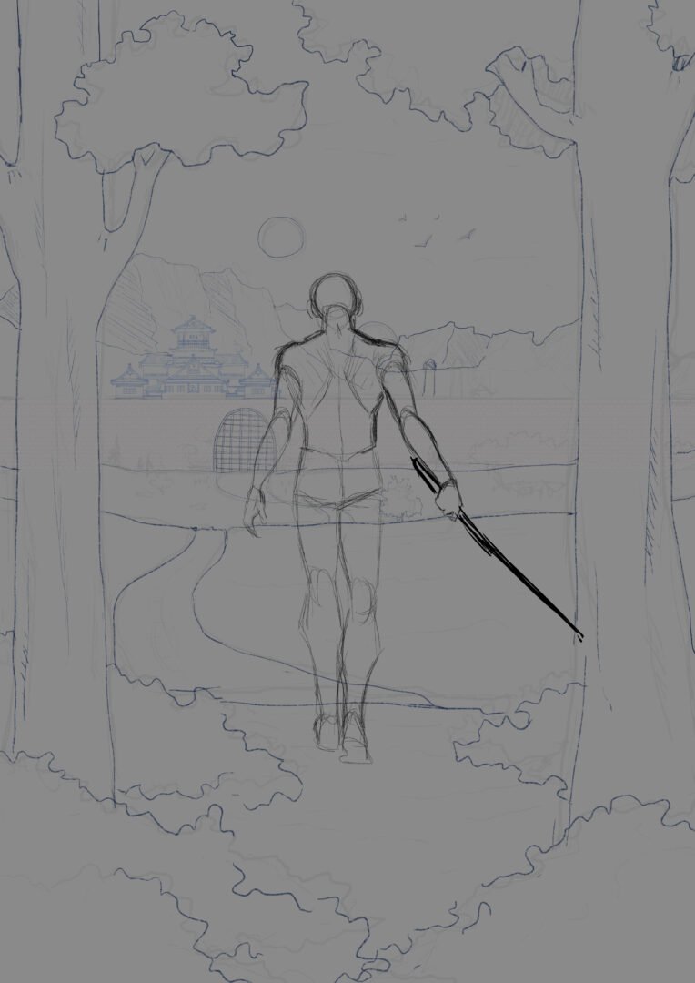
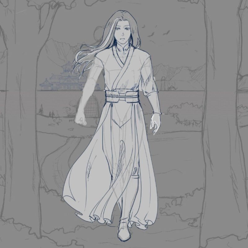
The character pose posed the greatest difficulty. I created multiple thumbnails to sketch out the big picture, keeping it simple. Despite being advised to leave out the character’s face, I chose to include it—it felt essential, as this is the main character, after all.
Progress and Techniques
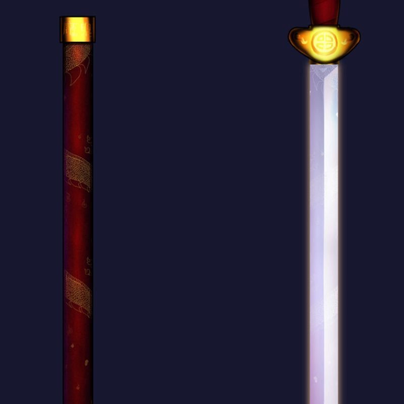
To speed up my process, I experimented with collage, mixing and matching reference images of real people until I found a pose that felt right. I wanted to add lots of textures to give the scene a more dynamic and lifelike quality. I focused on adding textures where they’d be visible and impactful, such as in the background and the character’s clothing, while keeping details like hair and distant walls less detailed to avoid clutter.
At one point, I added a glowing “power-up” effect around the character, which helped him stand out from the background. However, some viewers mistook it for sunlight, which distracted from the overall detail. Eventually, I toned it down to keep the focus balanced across the scene.
The Results
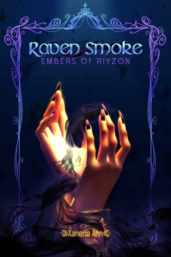
This piece was a journey of trial and error, and I learned a lot about balancing composition and texture in illustration. You can check out what the cover looks like on Webnovel by clicking the image below—it appears every so often, depending on the site’s rotation.

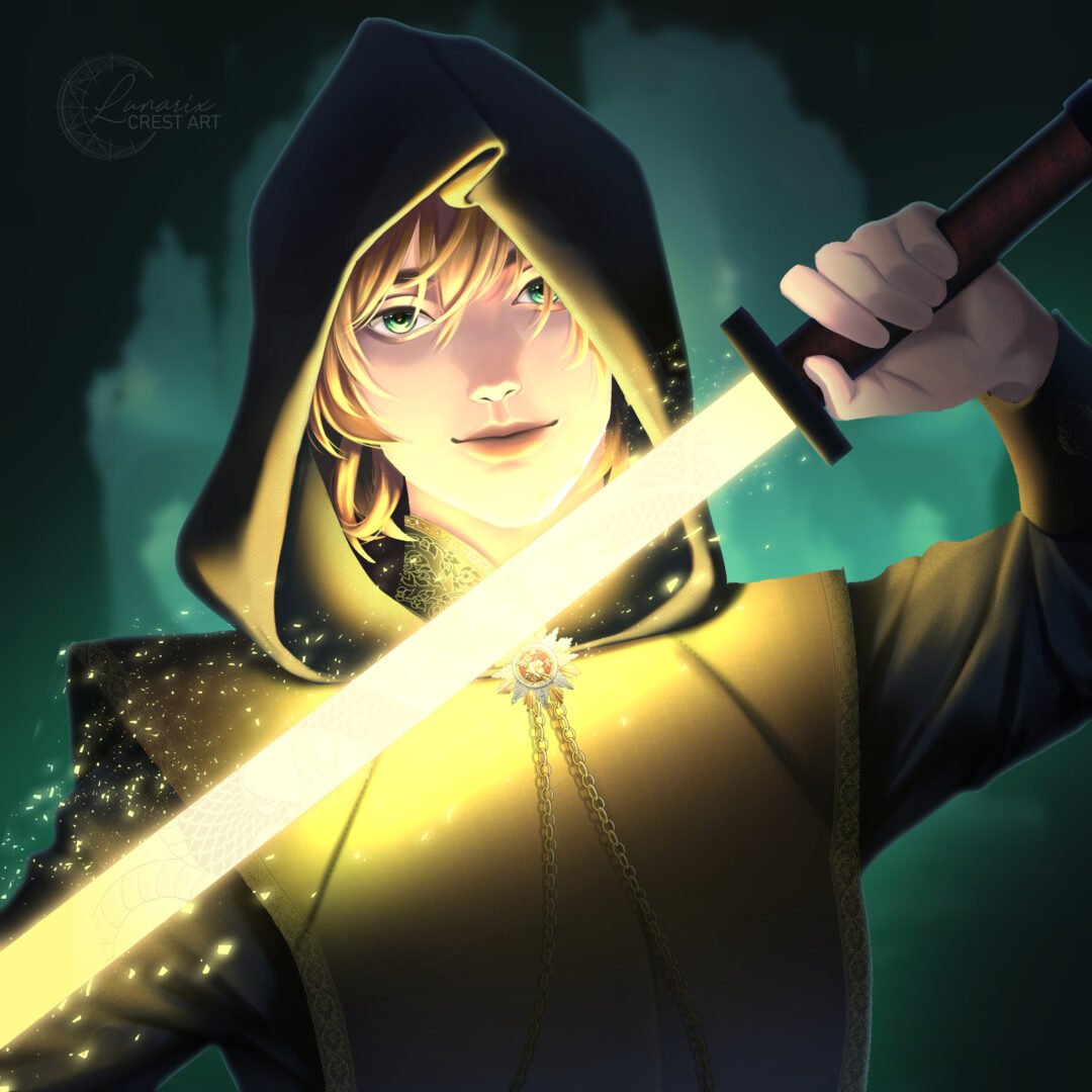
I really enjoyed working with Lunarix, the workflow was smooth and I was given lots of updates throughout the commission. If I was to get more artwork done, I would definitely commission her again.
