Overview
This project was all about building a kid-friendly milk brand from the ground up. I wanted something warm, approachable, and bursting with personality — something that children would genuinely feel drawn to, and parents would instantly recognize on shelves.
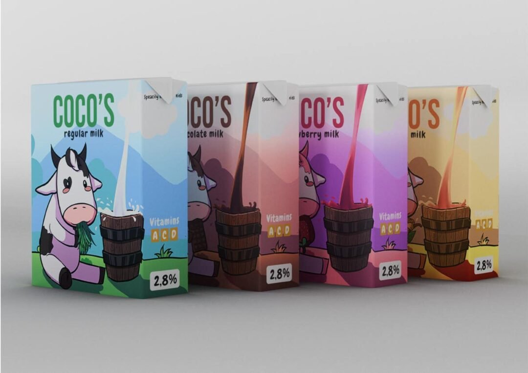
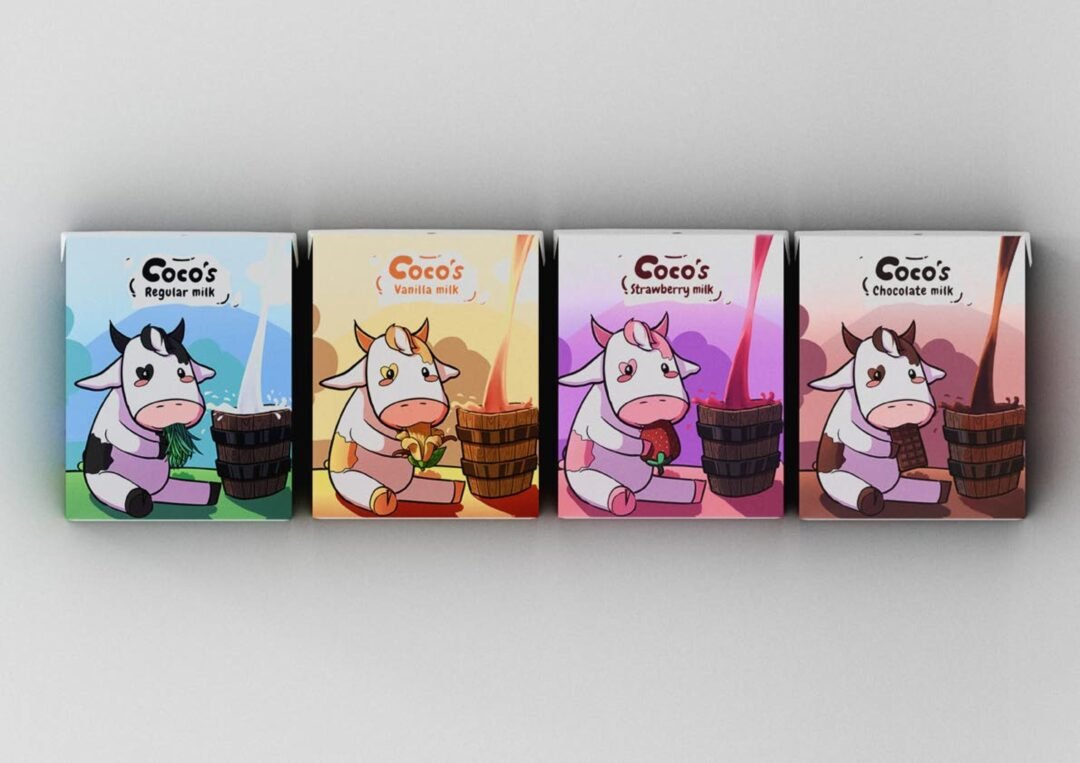
When I started researching kid-oriented branding, one thing stood out immediately: mascots are incredibly effective at forming emotional connections with young audiences. So I leaned fully into that idea and created Coco, a sweet, chibi-styled cow with a simple silhouette, soft shapes, and big expressive features.
To make the brand instantly recognizable across different products, I developed a color-coded mascot system:
– Vanilla milk: gentle yellows
– Strawberry milk: soft pinks
– Chocolate milk: warm browns
– Regular milk: classic cool tones
Involvement
- Digital Art/Illustration
- Graphic Design & Branding
- Marketing Materials
The Results
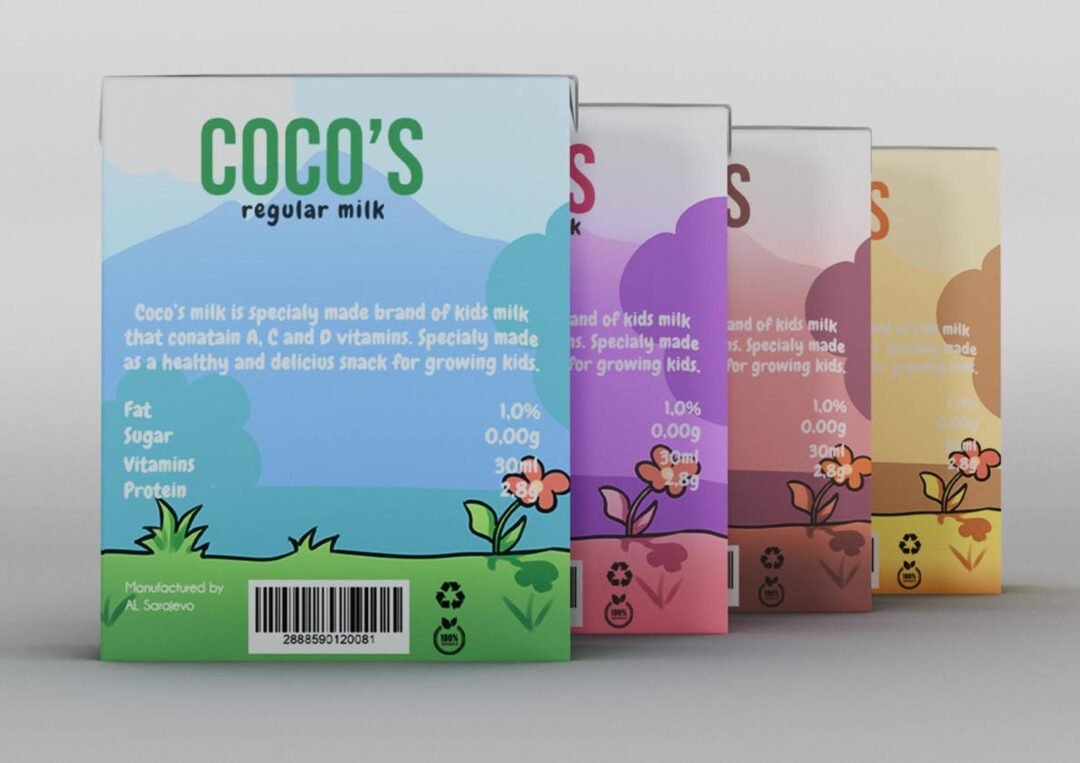
Each version of Coco was matched with its own themed environment, creating a cohesive world that kids could imagine and play with.
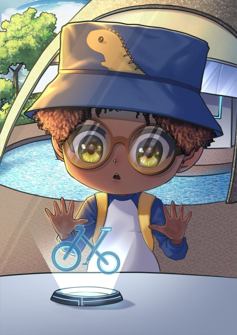
Beyond the mascot, I expanded the identity with supportive visuals — stickers, posters, and puzzle illustrations — all designed to keep the tone cheerful, friendly, and engaging. Every asset aimed to feel collectible and fun, encouraging kids to interact with the brand beyond just the packaging.
The final identity is playful, expressive, and easy for children to connect with. Coco shines as the heart of the brand, with multiple color variations and marketing illustrations that build a consistent, joyful universe around the product.