Case overview
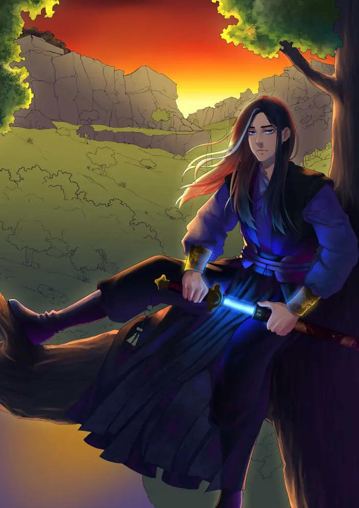
This was one of the most challenging projects I’ve tackled throughout my studies: a Webnovel cover intended as the first in a trilogy. The goal was to create an eye-catching design that would appeal to shounen (young male) readers while staying true to the author’s vision of the main character sitting in a valley surrounded by mountains.
I went through numerous sketches, and most of them followed a similar color scheme. After a few rounds of consultations and critiques, an issue arose—the vibrant sunset in the background was overpowering the rest of the illustration and typography, making it hard to tone down the orange hues effectively.


Approach
I didn’t want the sky to overshadow the details and effort poured into the drawing, nor to distract from the title. I tried making the oranges more pink, adding a glow to the character’s sword as if infused with power, darkening the background using multiple layers, and even adding a glow around the character to increase contrast. Nothing seemed to work.
At that point, a little switch flipped in my mind. Frustrated with the limitations of my ideas and knowledge, I decided to try a new approach. Since I couldn’t make the character stand out by brightening him (given his darker design), I reimagined the scene as a nighttime setting.

Typography
This meant redrawing nearly everything, as I had already revised the composition multiple times to address anatomy, stiffness, and layout issues. But after putting in the extra effort, this was the result.
Before I could celebrate, however, a new challenge arose: typography. I had accounted for space for the title, but I hadn’t thought through the style or execution. Typography has never been my strongest skill, so I explored countless typefaces, eventually settling on one. The initial feedback was, “It’s bold—a bit too bold for the illustration.” Now, the typography became the distracting element.
I worked through several more sketches and brainstorming sessions, gathering feedback from others. There were key factors to consider, such as making the text readable across various platforms and ensuring it complemented all three covers in the trilogy. An unexpected challenge was that people often read it as “The Legendary Frank,” which was amusing at first but quickly became an obstacle.
To solve this, I adjusted the composition of the title. I aimed to make the “F” stand out without overwhelming the illustration. After getting the author’s approval, I added a subtle cut into the “F” that connects to “Rank,” creating a distinction that keeps it noticeable but not distracting.
The Results
Here’s a little secret: I worked on this project over several months. I was relatively inexperienced with environment design and found illustrating rocks and stones particularly challenging. I started this cover during summer break but abandoned it multiple times out of frustration. In the end, it turned out to be a rewarding process that coincided with a university project, allowing me to apply what I was learning.
After putting it all together, this is the final piece. You can view this cover and the other two in the trilogy on Webnovel by clicking the image below.
I really enjoyed working with Lunarix, the workflow was smooth and I was given lots of updates throughout the commission. If I was to get more artwork done, I would definitely commission her again.


